Photoshop Save The Date Announcements
 My
main objection when designing the save the dates was to do something
different. I grew tired of seeing the same old thing come in the mail every
time someone I knew had a wedding. For my wedding, I felt like I could make
something truly unique and have it be about the same price as ordering
traditional cards.
Inspiration
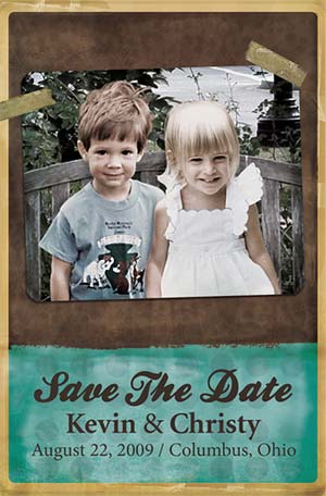
My idea was to combine 2 photos of myself and my fiancée when we were
little and try my best to make it appear that it was one photo. I wanted
people to second guess themselves when they saw it and say, "Did they know
each other when they were little kids?"
 All
the work was done in Photoshop. The first step was to dig through the old
photos and find a photo of each us that we thought would work well together. I
quickly realized the easiest way to do this would be to cut us both out of the
photos and add a background from a 3rd photo. The park bench you see in the
finished piece is just a photo of an empty bench that I found.
The hardest part was adjusting the lighting and the color of all 3 photos for
it to look right. This took quite a bit of time but was very important if I
wanted the finished piece to look real.
The rest of the design is just a collection of old papers and textures that I
found online. There are a number of great sites where you can find find free
resources to use for this. The teal and brown is the color scheme of our
wedding.
Printing
We had them printed through OvernightPrints.com, an online printer. They
are 4" x 6" single sided postcards, so all we had to do was slap a stamp and
an address on the back and throw them in the mail!
Made by Kevin Lucius
www.KevinLucius.com


